Sunday 1 June 2014

SHELF SPACE


FINAL PRODUCT


HOLDING THE ZINE TOGETHER.

Due to the style of my zine, I need to find away of making all the pages fold out without getting the zine printed professionally. So with this I experimented with different stuck on papers, different colour tapes and also gluing the pages together. All these attempts can be seen in my sketch book on the mock zine pages. The style I preferred and liked the best was using tape - yes it can appear quite messy but I preferred the rugged look it creates. Originally I was using brown tape, but I felt that it was too thick and too see through. I tried cutting it, but this created a messier look which made my zine look as if it had been made quickly. So with this, I went out and looked at different tapes - I found red, green, blue and black. I made the decision to use black because it worked better with the theme of my zine and also  had more of a sleek appearence that worked with the rest of the zine. This can be seen on my 3rd mock book ... as it worked with that zine, I then used it on my final product. 


BELLY BAND DESIGN

As I mentioned before, my zine will require a belly hand so I can hold both books together. This will also work as a design feature, which I feel will make the zine more appealing and high quality. I've stuck with my initial ideas regarding the design of the zine, which was black with white font. Below is the finished product which I easily created on photoshop :


I created them by using the square shape tool and setting the colour to black. This was very simple to do and enabled me to get the lines straight and looking neat. I then used the text tool, to create the logo - with the same font as i've been using through out the zine - and began placing them in different sections of the bars. This was because I didn't know what placement I wanted the text on my zine and also to make sure if I wanted it in the middle, that it would do that.  As it turns out, I used the top bar anyway. The rest can be seen in my sketch book. 

Overally I really like the simplicity of this belly band and feel it works really well with the theme of my zine. 

MAP LAYOUT OF FINISHED ZINE


MAIN ZINE LAYOUT/ MAPPING


ZINE COVER LAYOUT/ MAP


Thursday 29 May 2014

Online version of 3RD MOCK ZINE.

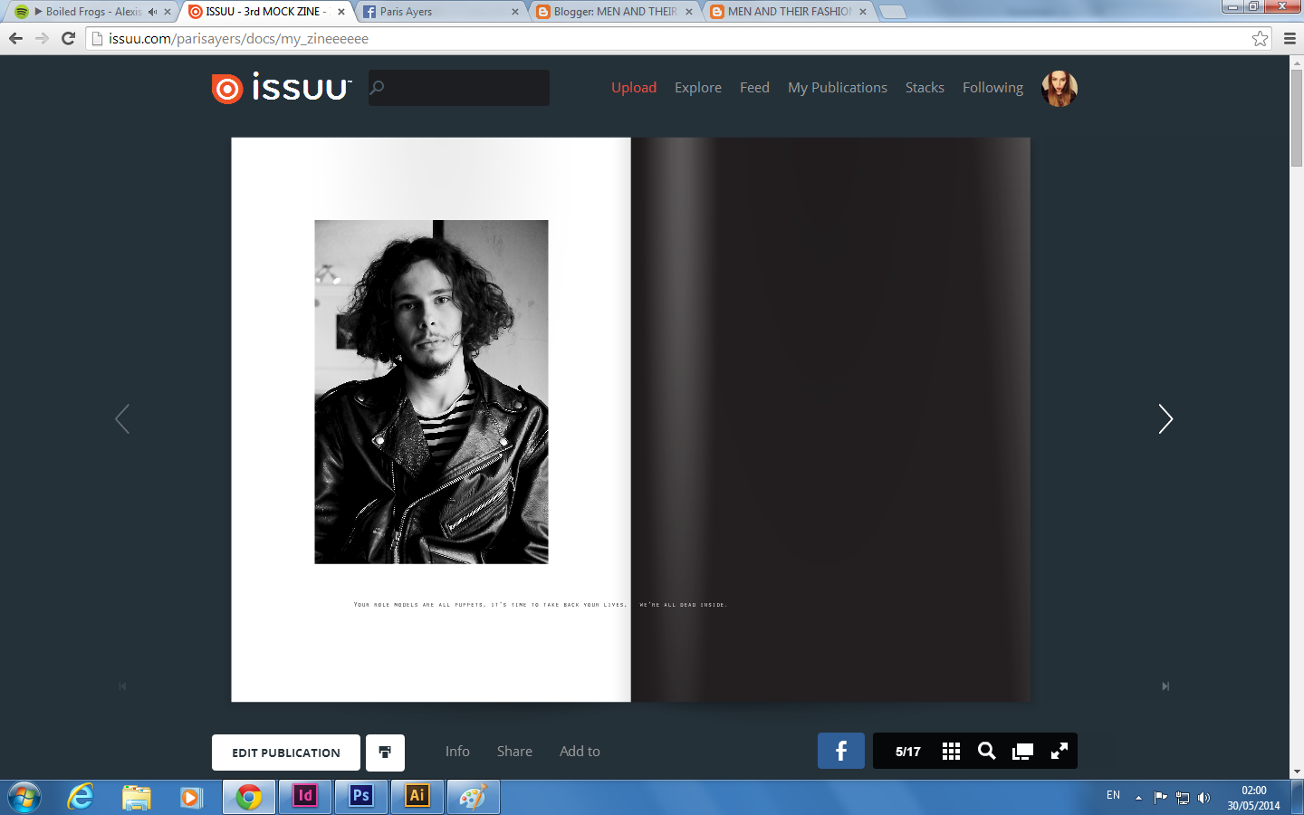
As my 3rd mock zine was created on INDESIGN, I was able to convert the finished product into a PDF and upload it to ISSUU. This allows me to post it on here for you to see as proof - as my sketch book might not be available to you. 

The direct link for it is here :

http://issuu.com/parisayers/docs/my_zineeeeee

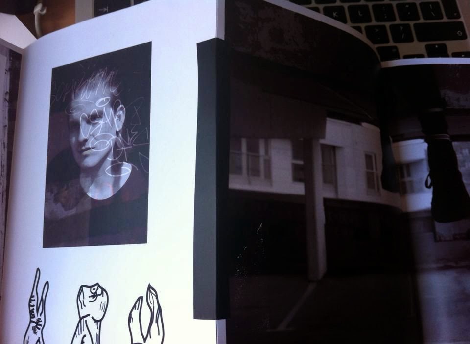
I really like how this zine looks on the ISSUU website, however there was many reasons as to why this zine didn't work for me. One major issue was the layout, as the pages were set to portrait, I was unable to fold the paper in half to create the effect and layout I wanted. Of course I could have kept the pages how there were and taped down each side, but this would have meant a 17 page long zine which would have been very difficult to read and also there would have been a lot of tape, which would have made the zine look very messy. Another negative to this was that the image didnt quite match up on each side, it was harder to create double layouts, which is something I really like in my new zine. 

Other negatives to this mock would be the front cover, all though I will be keeping the general idea for my main zine. The image itself is too grainy. I thought that if I added noise to my image,it would give it more of a vintage effect, however with the monitor I'm using I couldn't tell just how much noise was added and the image ended up looking awful quality rather than vintage. Another element I have forgot to mention would be the size. I really dislike the zine being A4, simply because it gives the impression that the zine is a lot of photocopied hand outs stuck together. It doesnt give off he handmade with love effect I want or even that much effort was put in to the making of the zine. I also think that the size is too big to read comfortable. A5 allows you to interact with it better. 

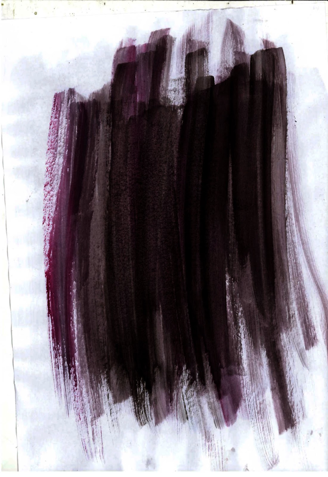
Issues that making this mock has raised were the use of page design, so the layout, how I set it up on indesign, the page itself - so figuring out that landscape is a better set up.  Making this zine has also allowed me to view some of my ideas in more detail, it has allowed me to figure out what layouts I like, if I should keep the font im using - which would be a yes and also if the water colours work within the zine - I personally feel that they do. 

PRINT SCREENS OF ISSUU


Water Colours

As I wanted my zine to have a handmade element to it, I decided that some of my backgrounds and designs on my page will be made from water colours. These water colours were done by me, then scanned onto the computer, where I opened them in Adobe Photoshop and changed the levels, so I could create a darker look to them - this helped this idea work better with my zine ideas. 

I tried many different colours and styles of water colours, but this was the one I felt worked the best within my zine. The dark blacks and reds match the colour theme and also the personalities of the males. I also feel that it has a good connection with the name 'I'm the son of rage and love' - it needs the colours red and black. I would consider this the main reason I went with these colours and this design. 


Here is an example of how I've used it within my zine, first and second images taken from one of my earlier mock zines which can be found in my sketch book. The second taken from a B+W mock of my finished zine. 


Picture proof of me making the water colours :