Tuesday 22 April 2014

DANNY SANGRA

I found the photographer Danny Sangra on 125 Magazine. I went onto his own personal website and looked through his various projects. But the one that stuck out for me, would be this image below. The black and white makes it bold, which is an obvious feature. But what I really like is the subtle, out of focus image behind the interesting words and typography. This style is really interesting to me and something I could experiment with in my images - not all of them though, other wise it'll take away the story and effects of the portrait images i've taken. This type of effect is very eye catching, although I'm not sure it makes me feel any emotional connection to it. 


TOPMAN


BEN MORISS


125 MAGAZINE - THE CRAFTSMEN 

I've been going through 125 Magazine quite a lot for this project and with doing that I've found some really interesting photographers. One being Ben Moriss, his work is artistic, extremely talented and when it comes to mens style photography, he challenges the style of photography.


PALLADIUM MAGAZINE 


ALL SAINTS CAMPAIGN 


CAT GARCIA


Cat Garcia is a portrait photographer who recently entered her work into 125 magazine under the theme of escapism.


GAVIN WATSON

I love the casual yet gripping feel Gavin Watson captures in his images. They ooze out this British feel that I find really inspiring. It's like an interesting documentary. Most of his models, or should I say all of them are male which is why I've chosen to research into his work as it links perfectly with mine. I also like how he isn't 100 percent fashion based, which is actually what im swaying away from. So Watson is a prime example to look at, he has a healthy balance of fashion and portraiture. 


PHEONIX MAGAZINE


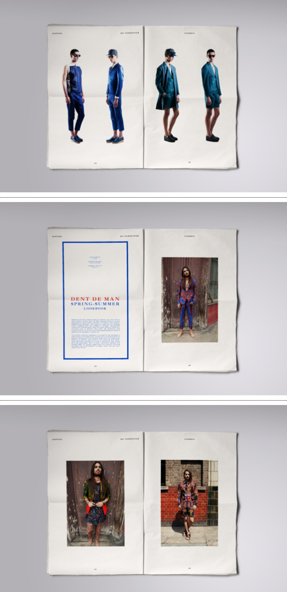
Phoenix is a newer, very pop culture inspired magazine, which If I'm honest I have no interest in. However, as I was flicking through I found myself being inspired by their use of typography and the edits of their images, such as borders. 
(Find more in attached sketch book)


The below are all ideas of page layouts that I would take into consideration when making my zine. I really like the mixture of designs the magazine has included within it. Such as clean spaces and then juxtaposed with vibrant, borders and patterns. This makes the magazines more interesting to read and holds your attention for longer.